The 'Locate Us' section of the Service NSW website was redesigned as a priority due to its lack of detailed review since its initial launch in 2019. Feedback from support staff highlighted that the tool was difficult for customers to use. Additionally, Service NSW had a stronger push to make digital services more accessible. The redesign aimed to enhance customer self-service, which is more cost-effective for the business compared to handling customer inquiries via support staff. The project spanned 18 months and involved close collaboration with five key designers and multiple cross-disciplinary stakeholders.

Locate us landing page with map open - Figma design
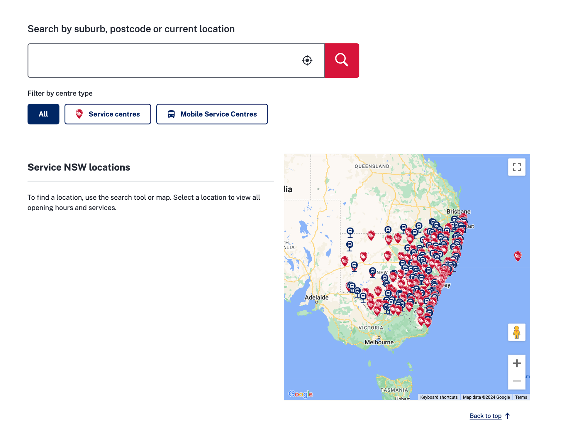
The 'Locate us' experience is a key tool in the Service NSW website, featured in the top navigation. There are a number of essential transactions that can only be completed in-person, with select locations offering niche services.
The experience is used by customers self-serving online, and staff offering advice to customers over the phone. The key stages of the journey are:
1) Search postcode or suburb
2) Results pages
3) Individual store/location pages
Project challenges:
The primary challenge was balancing simplicity with functionality. Since the demographic is 'all citizens of NSW', intuitive usability is a must. Customers needed to find stores quickly, but the interface also had to support different location filtering options: service centres; mobile service centres; and a new option to see disaster recovery centres. Additionally, the interface had to perform well across different devices, with particular attention to mobile users, who now make up the majority of our audience.
Prior user feedback played a significant role in shaping these requirements. Support staff had reported consistent issues with customers struggling to navigate the old system, particularly when trying to locate specific services or find relevant information quickly. Based on this feedback, we understood that we needed to clearly differentiate between store/location types, provide top-level information early, and make it obvious how to get to a full store page, where even more detailed information could be found. This feedback highlighted the need to prioritise usability and streamline the process for customers.
Prior user feedback played a significant role in shaping these requirements. Support staff had reported consistent issues with customers struggling to navigate the old system, particularly when trying to locate specific services or find relevant information quickly. Based on this feedback, we understood that we needed to clearly differentiate between store/location types, provide top-level information early, and make it obvious how to get to a full store page, where even more detailed information could be found. This feedback highlighted the need to prioritise usability and streamline the process for customers.
Original Locate us landing page
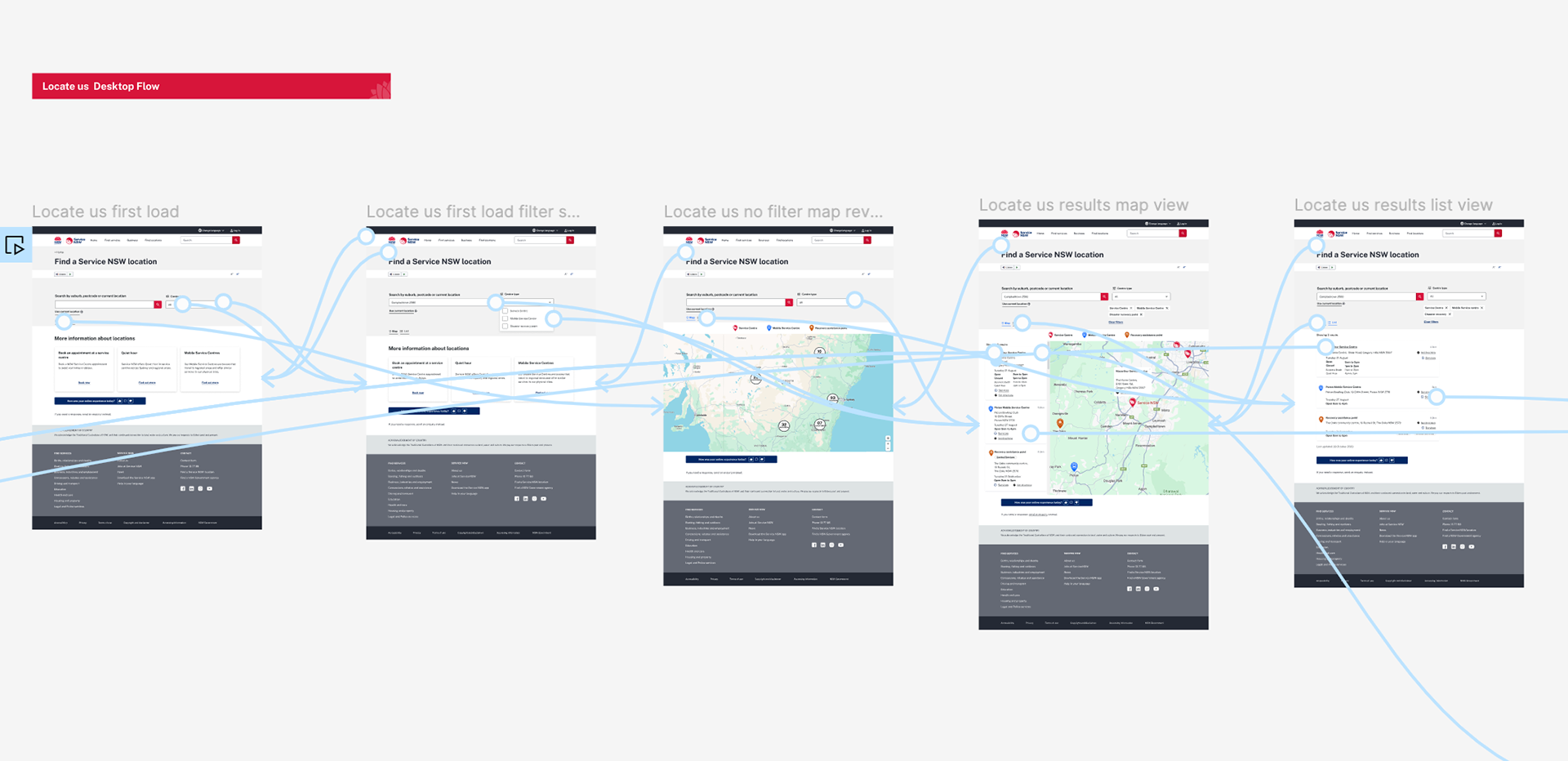
New design flow prototyped in Figma

UI challenges:
The original experience revealed all locations on a map prior to any search action, which many felt was a crowded and overwhelming experience. This was especially the case on mobile devices, with map panning easily leading to a blown out iframe what was impossible to get out of.
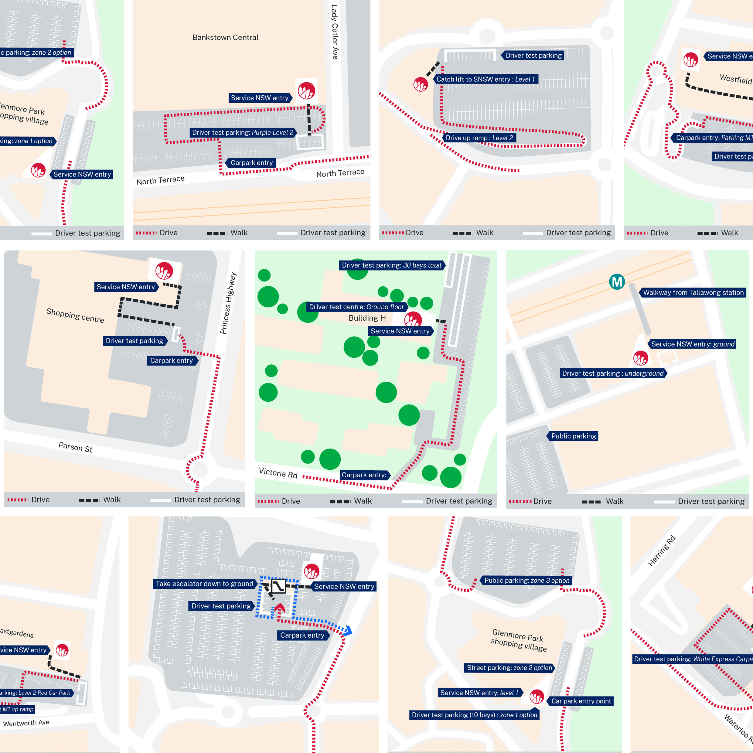
The original experience also returned a number of location card results, but with limited information on those cards, and an unclear path to more detailed information on a store page.
The process of arriving at the final designs:
Over 30 user test interviews were conducted throughout the project with both customers and staff, providing invaluable feedback that shaped the final product. The interviews were structured to be no longer than 45 minutes, either via Teams calls or face-to-face. Key questions focused on understanding what information users were looking for and where they would naturally navigate to find it. Some user interviews were specifically screened for disability/accessibility criteria to ensure diverse needs were considered. User satisfaction was measured through 10+ user feedback sessions and 6 support centre staff feedback sessions, with at least three representatives from each of the portfolios.
I was heavily involved in organising these tests, synthesising feedback, and iterating on the design based on real user input. This process allowed us to address pain points early and ensure the design met user expectations. While the interviews were effective, there was room for improvement in terms of standardising our questioning to better evaluate specific accessibility challenges and gather more detailed insights from users with disabilities.
Working closely with three other designers and many more team members (including developers, product managers, and content designers) I led the visual design effort while maintaining constant communication to ensure technical feasibility and alignment with business goals. I developed high-fidelity prototypes and interactive mockups in Figma, which were used for stakeholder reviews, internal testing, and external user testing. This helped bridge the gap between design and development, ensuring a smooth handoff.
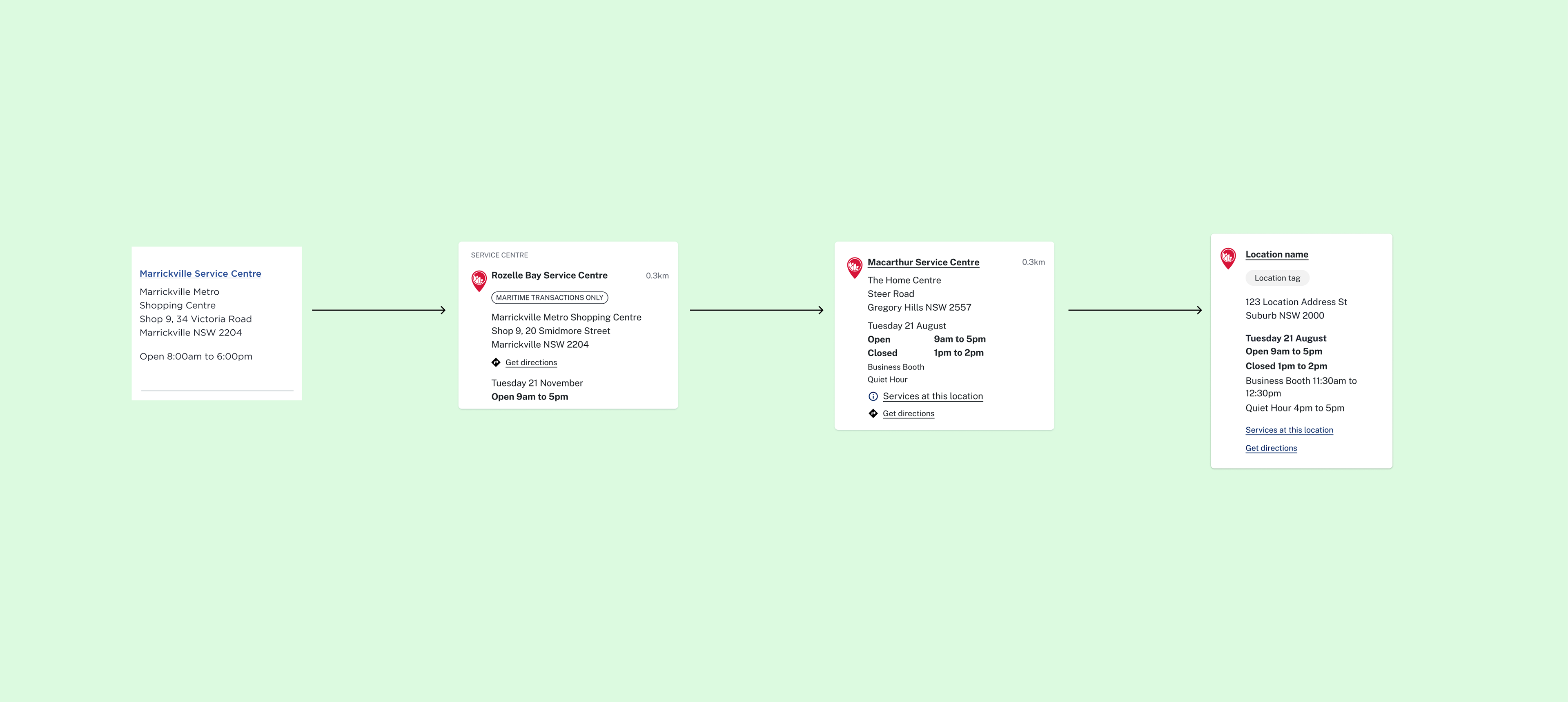
Old vs new results card design evolution - notice an increase in top-level information
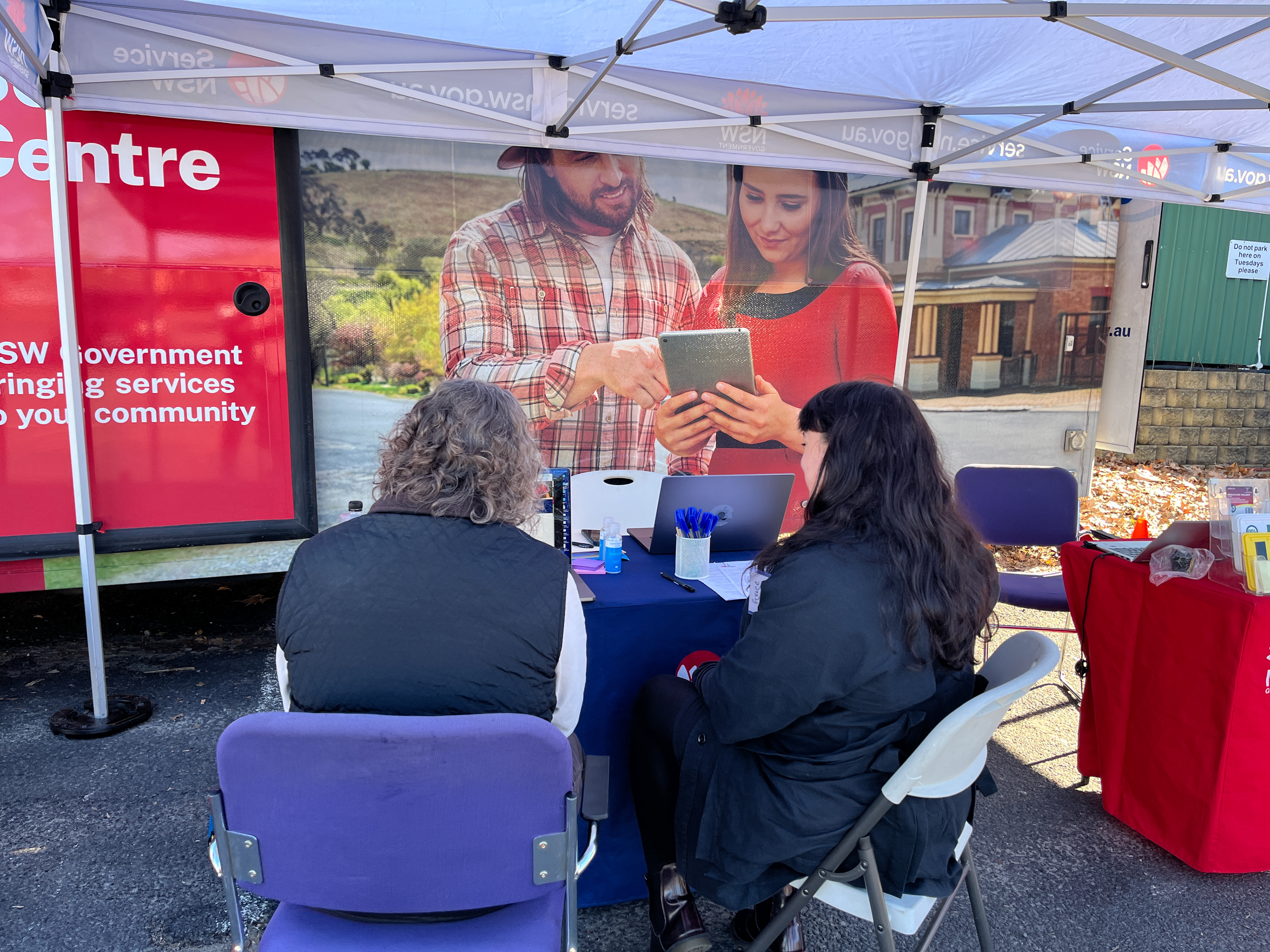
User testing at Picton Mobile service centre
Key changes were:
🌎 Map not presented on first load, to highlight the search task at hand
🗺️ Full-width map views and pin clustering when presenting 'all' results for a tidy look
🗝️ A map key explaining different location pins
🖇️ Multi-link result cards to take customers directly to the information that they are looking for
📩 Share links on store pages for staff and customers to send information easily
🪄Spelling out 'Use current location' in addition to a symbol for clear geolocation options
The redesigned store location UI is currently being rolled out, with a whole new map build in progress. Feedback from staff and users during final interviews praised the intuitive design and the improved functionality across devices. Beyond the product, the project played a key role in strengthening collaboration within the team, fostering an iterative, user-centric approach to design.
The relationships formed during this project set a positive example for how to work cross-functionally, with clear communication, collaboration, and constant feedback loops being essential to our success. The way we worked together: frequently engaging with stakeholders, developers, and product managers, has since influenced the team’s approach to future projects. It has established a model for iterative, inclusive design practices that will continue to drive our work forward. This project exemplifies my ability to lead complex, long-term design efforts while integrating user feedback and working closely with cross-functional teams, setting the tone for future successful collaborations.
The live product can be viewed at service.nsw.gov.au/service-centre
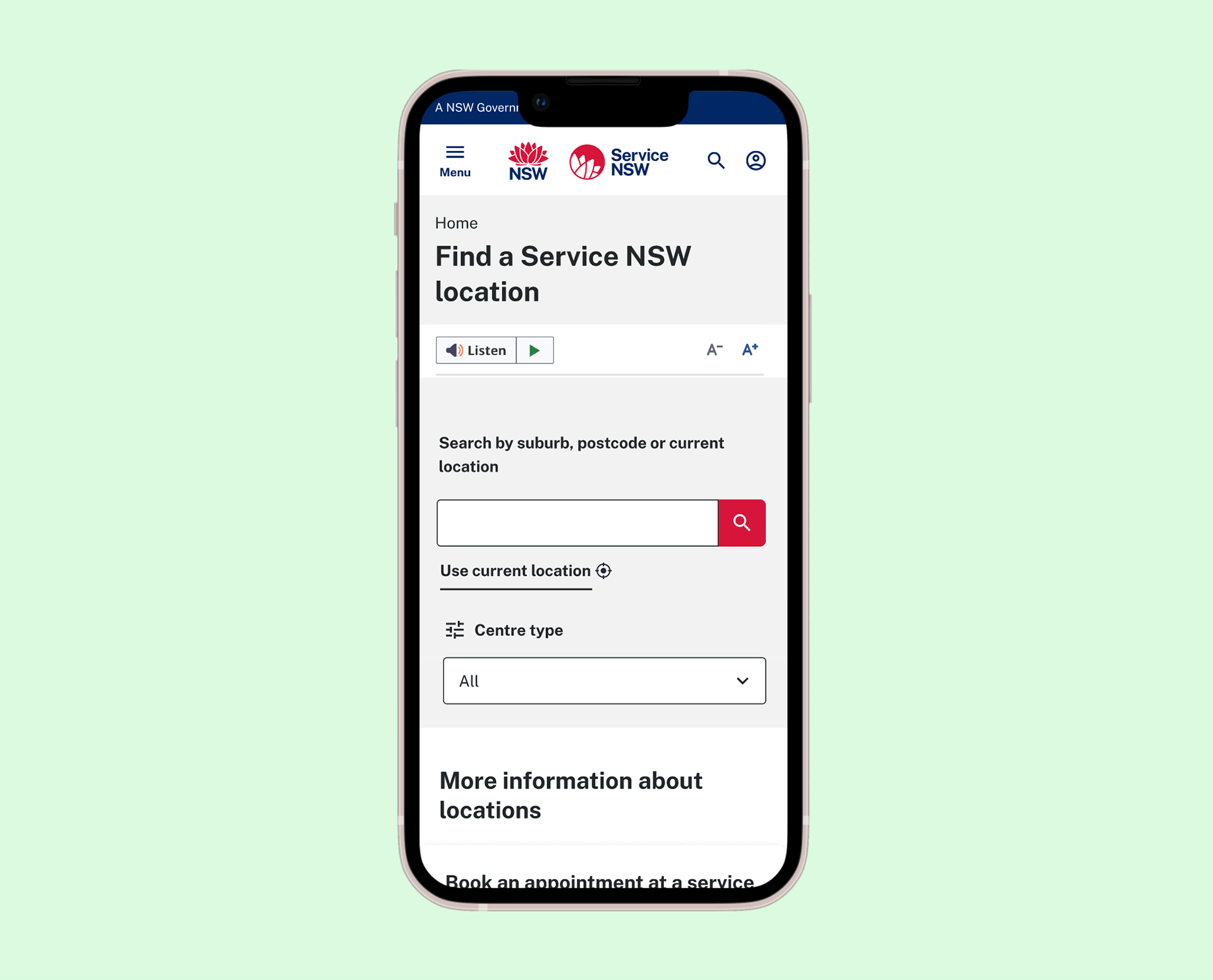
Mobile design layout
This video demonstrates the full user flow