While working as one of three designers in the Service NSW website team, I was appointed by our Product Manager to take on the lead design role for implementing the NSW Government design system update (GEL 3.0) across the Service NSW website. This meant I was responsible for interpreting the new system (its visual language, components, and interaction patterns) and applying it appropriately to our product, ensuring alignment with the updated design guidelines. To do this effectively, I collaborated closely with the Service NSW Design System team for clarity and alignment, and worked in tandem with our engineers to ensure the new look and functionality could be implemented efficiently and accessibly. With over 3,000 pages and roughly a quarter of a million daily users, maintaining usability and accessibility throughout the transition was critical to the success of the project.
Overview:
The project involved a complete overhaul of the Service NSW website’s look and feel to align with the updated NSW Government design system. This wasn't just a visual refresh, it was a high-stakes initiative that ensured consistency across NSW Government digital services, reinforcing public trust, improving usability, and supporting whole-of-government digital transformation goals. As a core product with over 250,000 daily users, failing to implement this correctly could have compromised accessibility, disrupted essential public services, and delayed compliance with mandated updates.
I created a number of bespoke components to extend GEL 3.0 specifically for our product, ensuring design consistency while accommodating complex use cases unique to the Service NSW website. In partnership with an external audit team, I interpreted and applied accessibility standards, ensuring the site met and exceeded WCAG 2.1 guidelines, and continued to serve all users, regardless of ability, effectively and inclusively.
Old homepage design on the left, with the updated homepage design on the right
Highlights:
As the lead designer on this project, I was responsible for guiding our team through the interpretation and implementation of the new NSW Government design system (GEL 3.0) across the Service NSW website. This system introduced a modern, streamlined visual language focused on clarity, accessibility, and ease of use.
Interpretation of the Design System:
I led the team in unpacking the GEL 3.0 guidelines—translating typography, spacing, colour palettes, and component usage into practical applications tailored to our complex product. With over 3,000 content-rich pages, this required careful adaptation to ensure consistency without compromising usability.
I led the team in unpacking the GEL 3.0 guidelines—translating typography, spacing, colour palettes, and component usage into practical applications tailored to our complex product. With over 3,000 content-rich pages, this required careful adaptation to ensure consistency without compromising usability.
UX/UI Design:
I partnered closely with our front-end developers to ensure the updated interface wasn't just visually appealing, but also intuitive and performant. This collaboration helped us create an experience that was seamless for users and efficient for engineers to implement.
I partnered closely with our front-end developers to ensure the updated interface wasn't just visually appealing, but also intuitive and performant. This collaboration helped us create an experience that was seamless for users and efficient for engineers to implement.
Cross-Functional Collaboration:
I coordinated with a wide range of stakeholders; developers, content strategists, accessibility experts, and product managers, to roll out the new design in a sustainable and incremental way, using themed sprints. One of the key ways I collaborated with front-end engineers was through fortnightly progress meetings with our PM on Microsoft Teams. In these sessions, we worked together to co-write detailed Jira tickets, ensuring everyone was aligned on what needed to be done, how it should be implemented, and why it mattered. This transparent, collaborative approach helped reduce ambiguity, speed up delivery, and ensure that the design intent was maintained throughout development. Regular feedback loops and design reviews also supported iterative refinement across visuals and functionality.
I coordinated with a wide range of stakeholders; developers, content strategists, accessibility experts, and product managers, to roll out the new design in a sustainable and incremental way, using themed sprints. One of the key ways I collaborated with front-end engineers was through fortnightly progress meetings with our PM on Microsoft Teams. In these sessions, we worked together to co-write detailed Jira tickets, ensuring everyone was aligned on what needed to be done, how it should be implemented, and why it mattered. This transparent, collaborative approach helped reduce ambiguity, speed up delivery, and ensure that the design intent was maintained throughout development. Regular feedback loops and design reviews also supported iterative refinement across visuals and functionality.
Prototyping and Testing:
Using Figma, I created high-fidelity prototypes that were shared with both internal teams and senior stakeholders. These prototypes were critical tools for communicating the design vision, validating proposed changes, and capturing feedback on how updates would affect user flow and overall experience.
Using Figma, I created high-fidelity prototypes that were shared with both internal teams and senior stakeholders. These prototypes were critical tools for communicating the design vision, validating proposed changes, and capturing feedback on how updates would affect user flow and overall experience.
Accessibility:
Accessibility was a foundational aspect of this redesign because Service NSW is a customer-facing government platform used by millions of people across New South Wales, including those with disabilities, older users, and people using assistive technologies. As a public service, it’s essential that the website is inclusive and usable by all citizens, regardless of ability. I worked directly with accessibility specialists to ensure full WCAG 2.1 compliance, making critical updates such as improving colour contrast, ensuring robust keyboard navigation, and optimising compatibility with screen readers. These efforts ensured that every user (regardless of physical, cognitive, or situational limitations) could access vital government services independently and with confidence.
Accessibility was a foundational aspect of this redesign because Service NSW is a customer-facing government platform used by millions of people across New South Wales, including those with disabilities, older users, and people using assistive technologies. As a public service, it’s essential that the website is inclusive and usable by all citizens, regardless of ability. I worked directly with accessibility specialists to ensure full WCAG 2.1 compliance, making critical updates such as improving colour contrast, ensuring robust keyboard navigation, and optimising compatibility with screen readers. These efforts ensured that every user (regardless of physical, cognitive, or situational limitations) could access vital government services independently and with confidence.
Mobile layout with updated design system elements
Detailed button update replacement guide for devs
The redesigned Service NSW website was rolled out incrementally, featuring fresh, modern interfaces that align with the new GEL 3.0 design system. User satisfaction was assessed through all-staff feedback surveys, as well as face-to-face QA sessions across the business. We received overwhelmingly positive responses about the streamlined navigation, improved visual clarity, and easier access to services. What surprised me most was how strongly users responded to seemingly small changes, like clearer headings and better spacing, reinforcing how much micro-interactions and layout contribute to overall usability.
If I were to do it again as the lead, I would advocate for even earlier involvement of end users in the design validation process (particularly during the component interpretation phase) so we could test assumptions sooner and reduce rework later in development. This project ultimately highlights my ability to lead complex design initiatives, balance creativity with functionality, and collaborate across disciplines to deliver a cohesive and accessible user experience at scale.
You can view this project live by exploring service.nsw.gov.au/
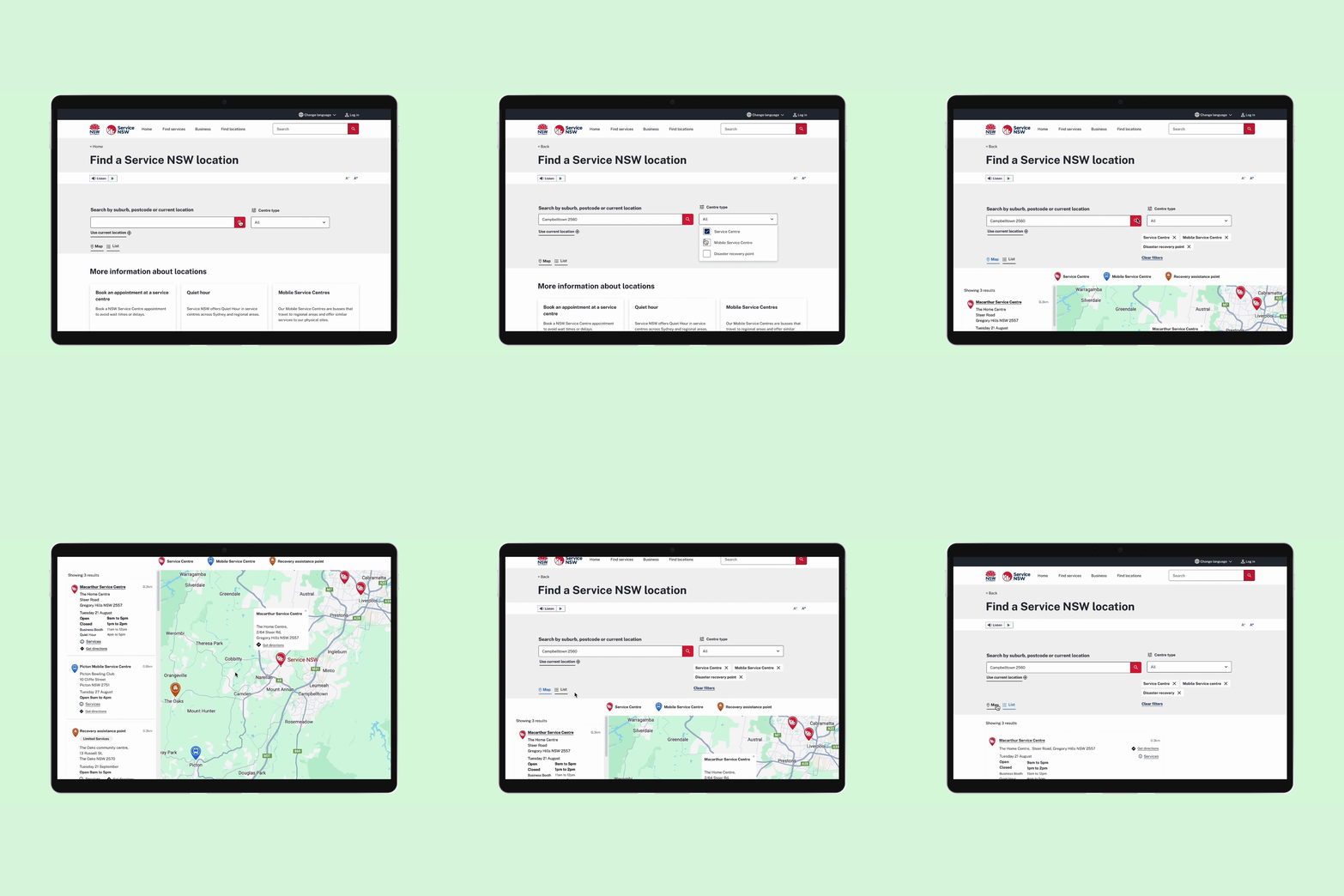
Design system updates on all page templates in desktop and mobile view


