As a designer on the website team, I took the lead in the redesign of Service NSW’s global navigation to address user pain points and enhance multilingual accessibility.
Through data-driven insights from Google Analytics 4, I identified Arabic, Simplified Chinese, and Vietnamese as our most commonly translated languages. I chose Arabic as a test case to evaluate the robustness of our design system, particularly its adaptability to right-to-left (RTL) layouts.
Original english layout Vs Arabic localised version
Key improvements included:
1) Enhanced language picker usability: Comparative analysis revealed that the existing dropdown only displayed language names in English. I recommended including the native script for each language, significantly improving usability and recognition.
2) Rigorous translation validation: I conducted an initial pass with Google Translate and collaborated with a native Arabic-speaking colleague to refine and validate the translations, ensuring they were more contextually accurate.
3) Homepage redesign for multilingual accessibility: I designed and tested an Arabic version of the homepage, identifying opportunities to strengthen the design system’s support for non-English layouts.
Updated language picker tool in the global nav
Subject card design comparison
The 65% increase in uptake of the automated translation tool validated the impact of these design interventions, improving access to essential government services for diverse language communities.
This work contributed to the 'Towards 2030' project, an organisation-wide exploratory design initiative. The assets I developed were presented to the minister of the Service NSW portfolio by our head of design, shaping strategic conversations about the future of digital accessibility in government services.
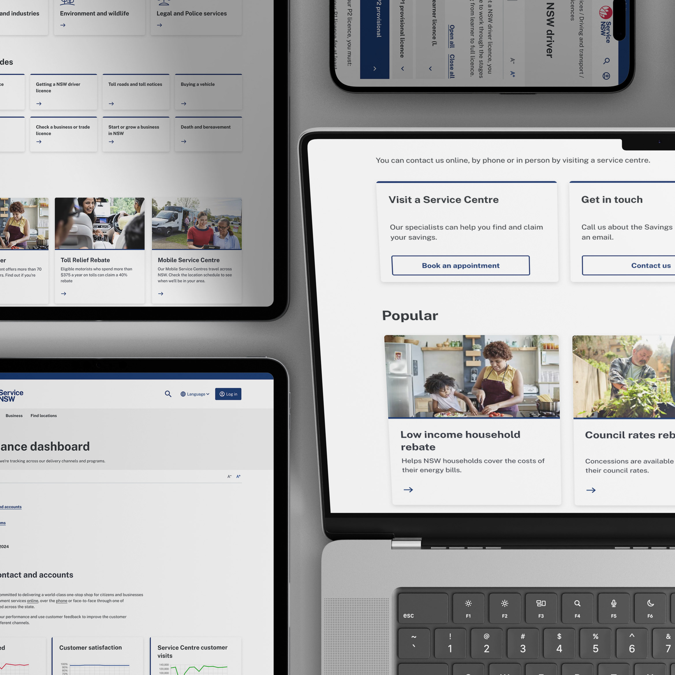
Arabic design in-situ


