"How might I create original design assets and remix an existing brand for an Australia-wide exhibition that had to quickly pivot online?"
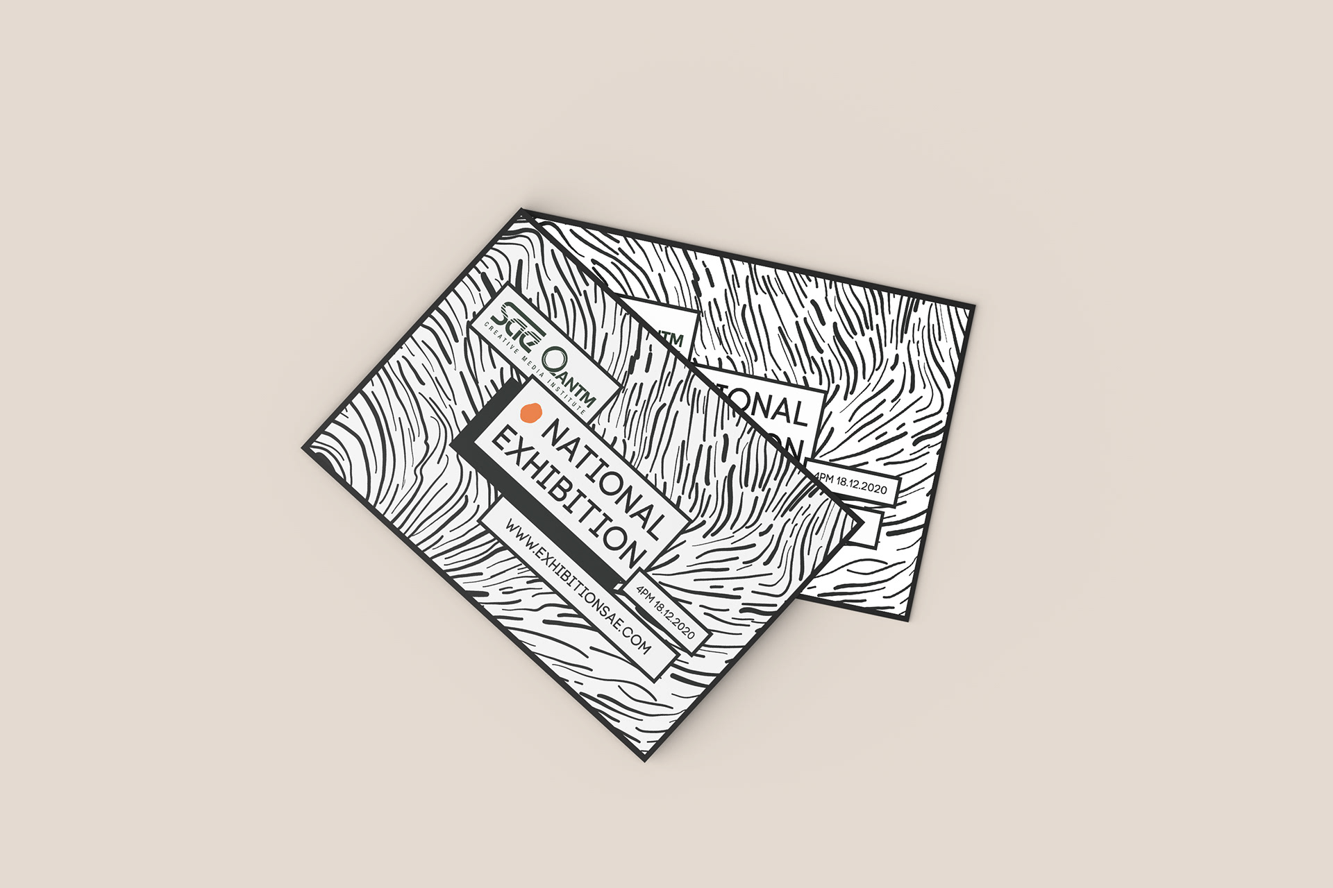
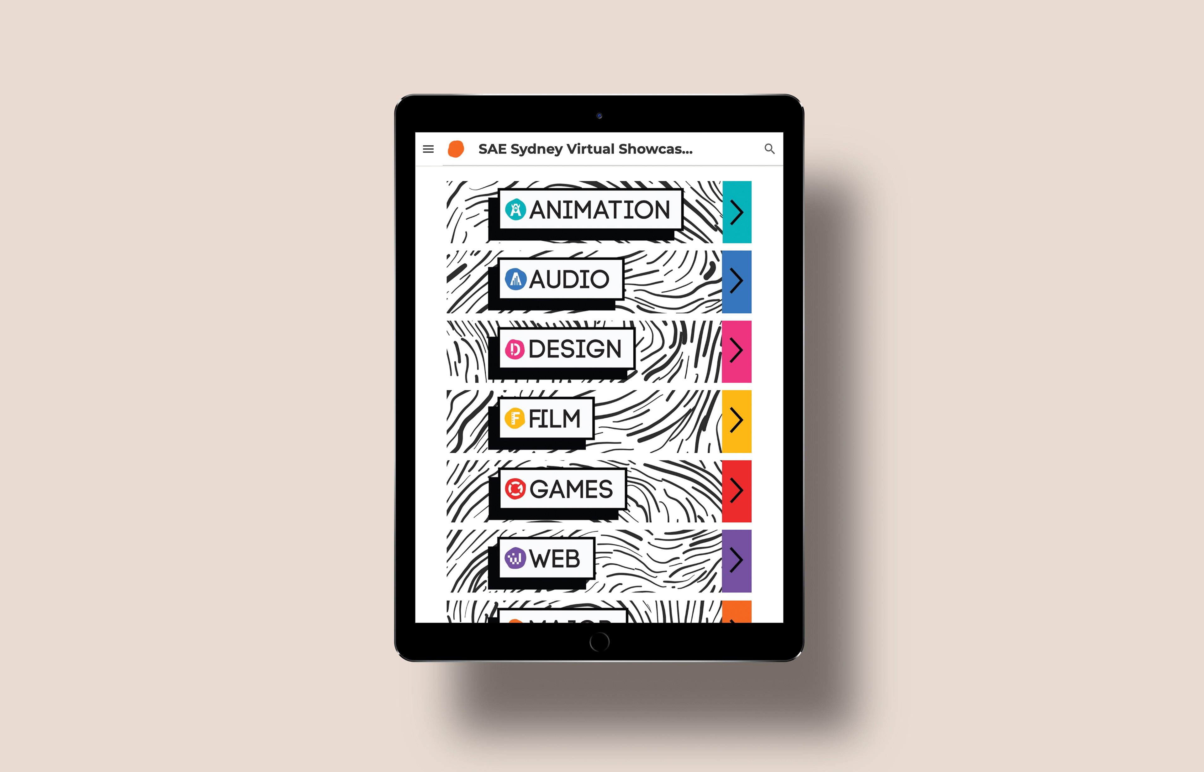
I needed to work within the already established brand guidelines of the institute, that means discipline-specific colours and the use of Code Bold font for all headings. As their brand colour palettes are quite bright, I decided a bold monochromatic look with pops of colour was the right way forward.
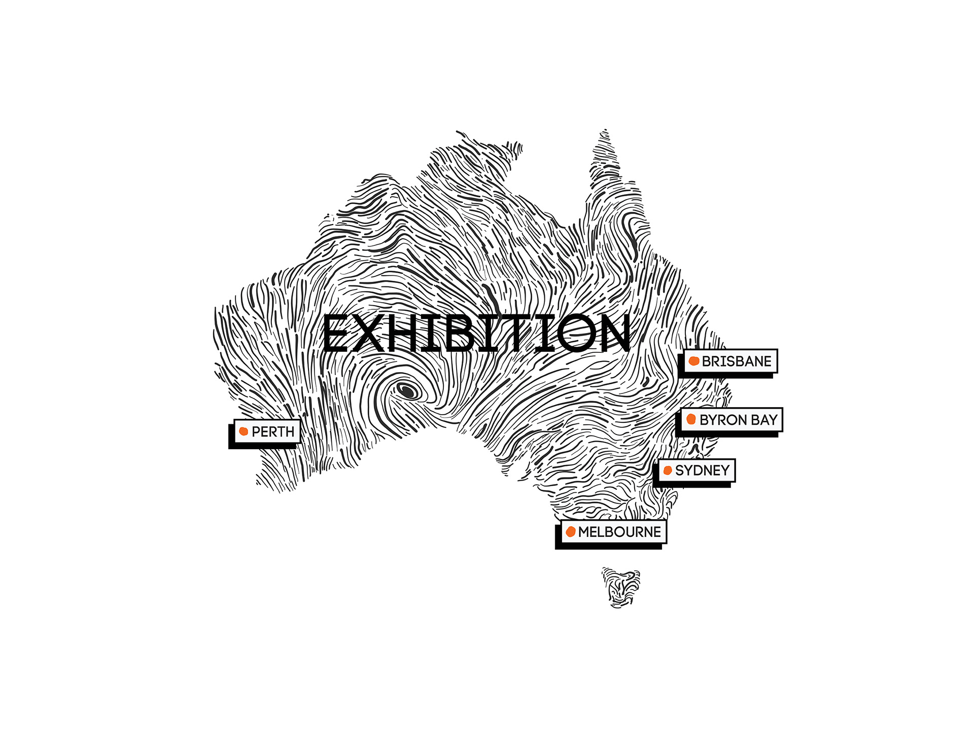
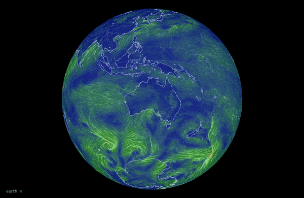
I was inspired by the themes of 'change' and 'movement' when considering the original graphic assets I could make for the platform. I came across this live visualisation of global wind patterns created by Nullschool and used this as a basis for my illustration. The pattern also worked like an animal print in the background of most print and web collateral.
earth.nullschool.net
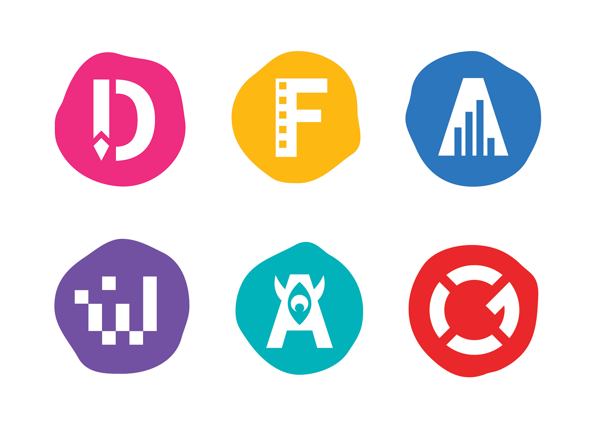
I wanted to gently remix the original discipline logos to better match with the curved lines from the illustration, so I just varied the shape slightly to look more organic.
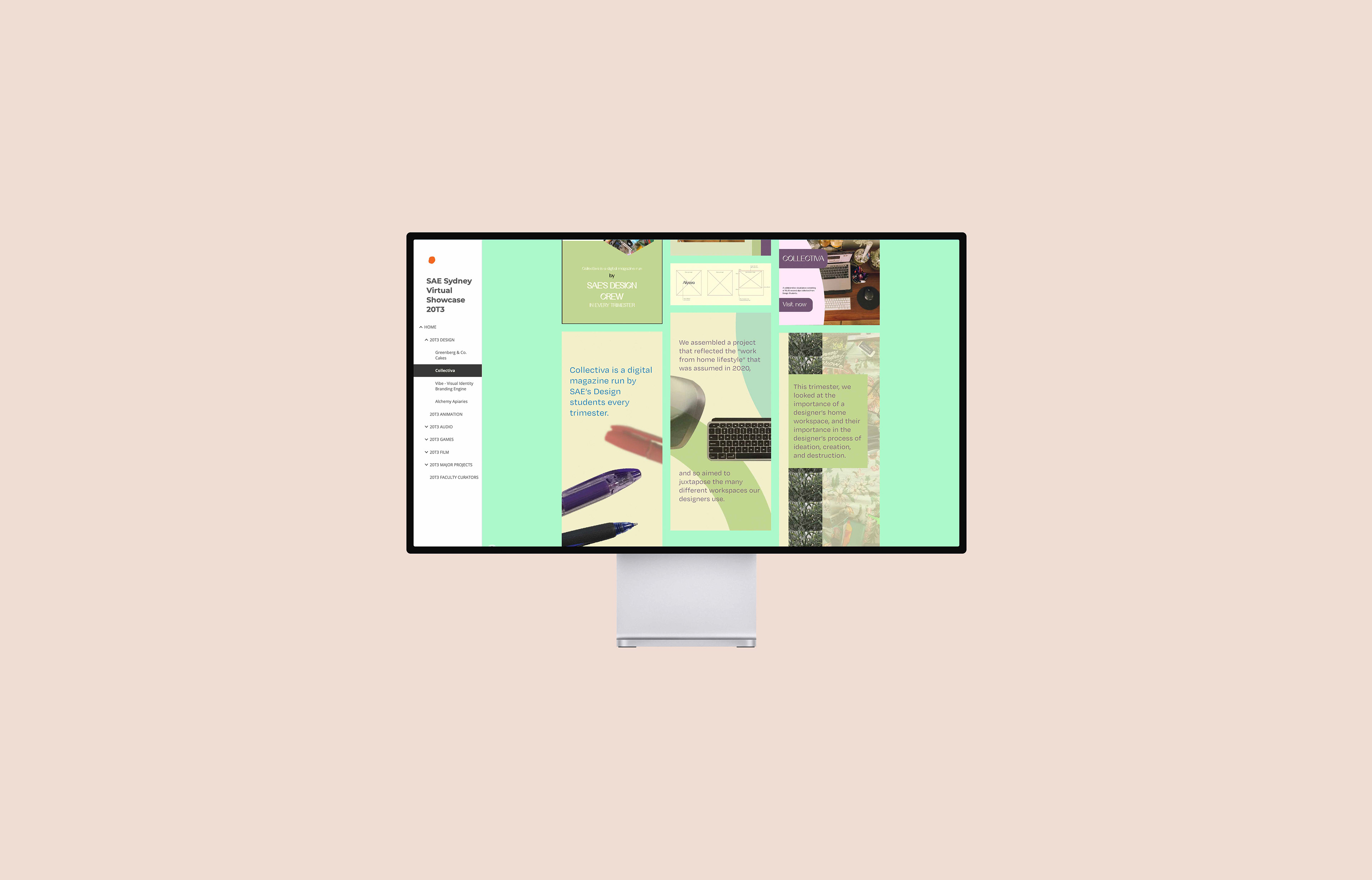
However when it came time for actually displaying student projects, I made the site navigation simple and minimal, allowing their work to shine without interruption.