"What kind of aesthetics and information attracts clients to visit a small art-house cinema?"
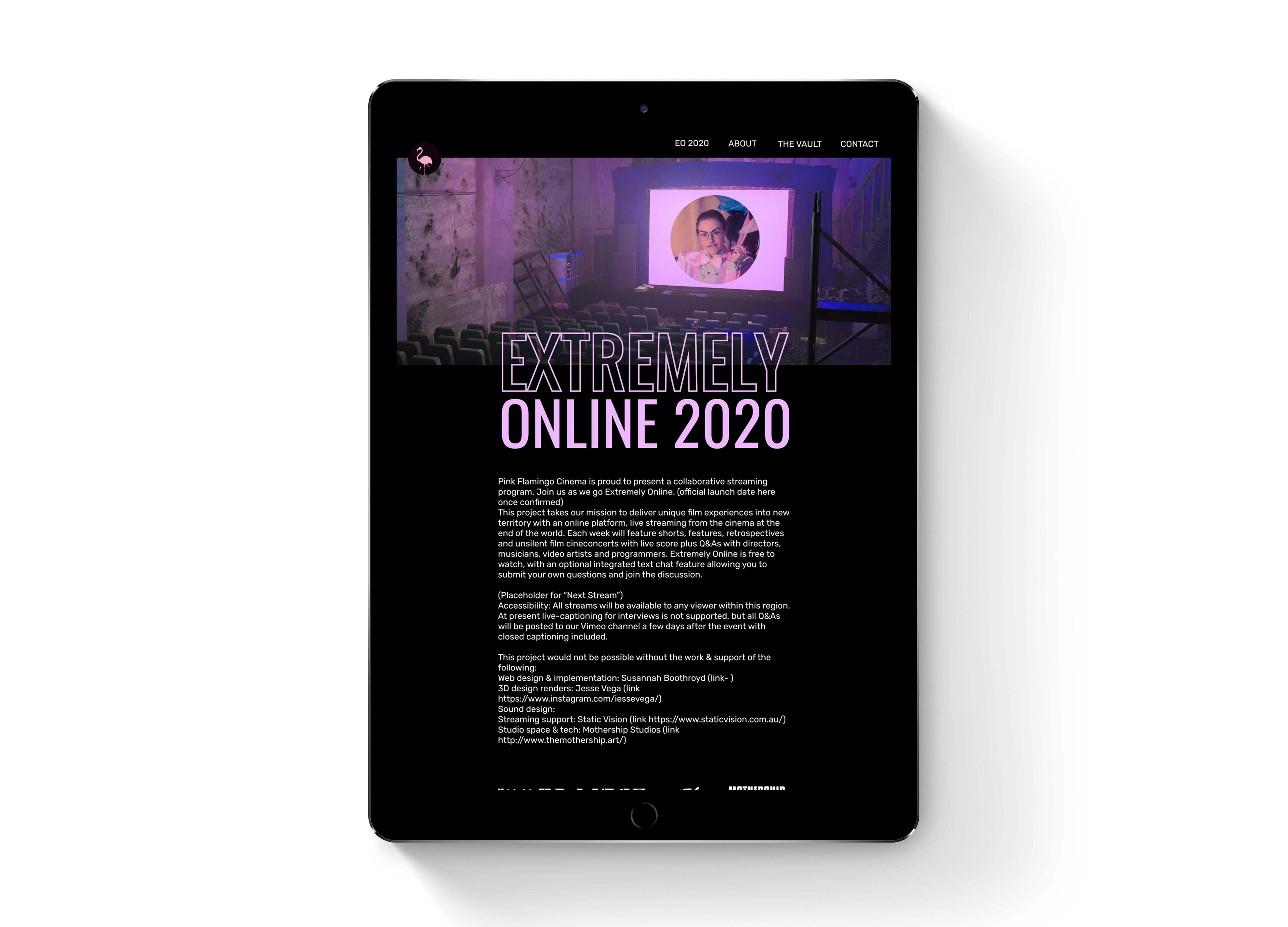
After winning an Inner West Council Covid-19 resilience grant in 2020, there was a need for the cinema website to have a brand refresh in preparation for hosting an entirely online program. The brief from Ripper was "Bold and dark with neon highlights". 3D Artist Jesse Vega was commissioned to create a number of imagined post-apocalyptic scenes for the project to keep with the plague vision we were all feeling at that time.
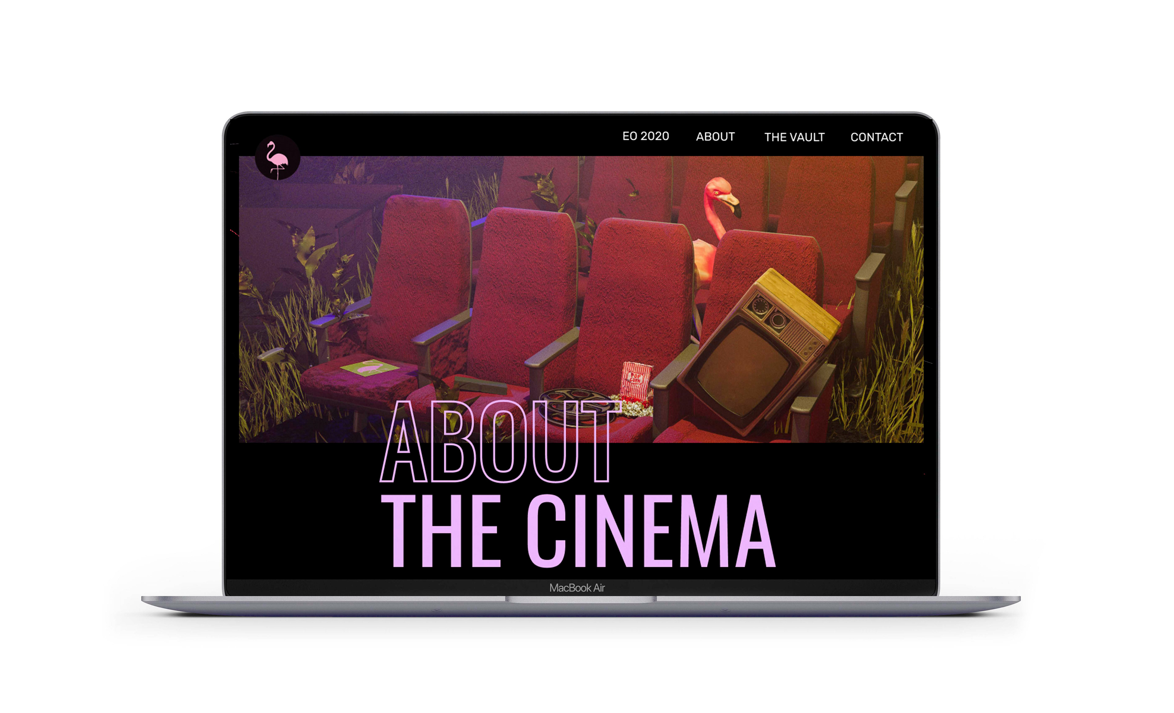
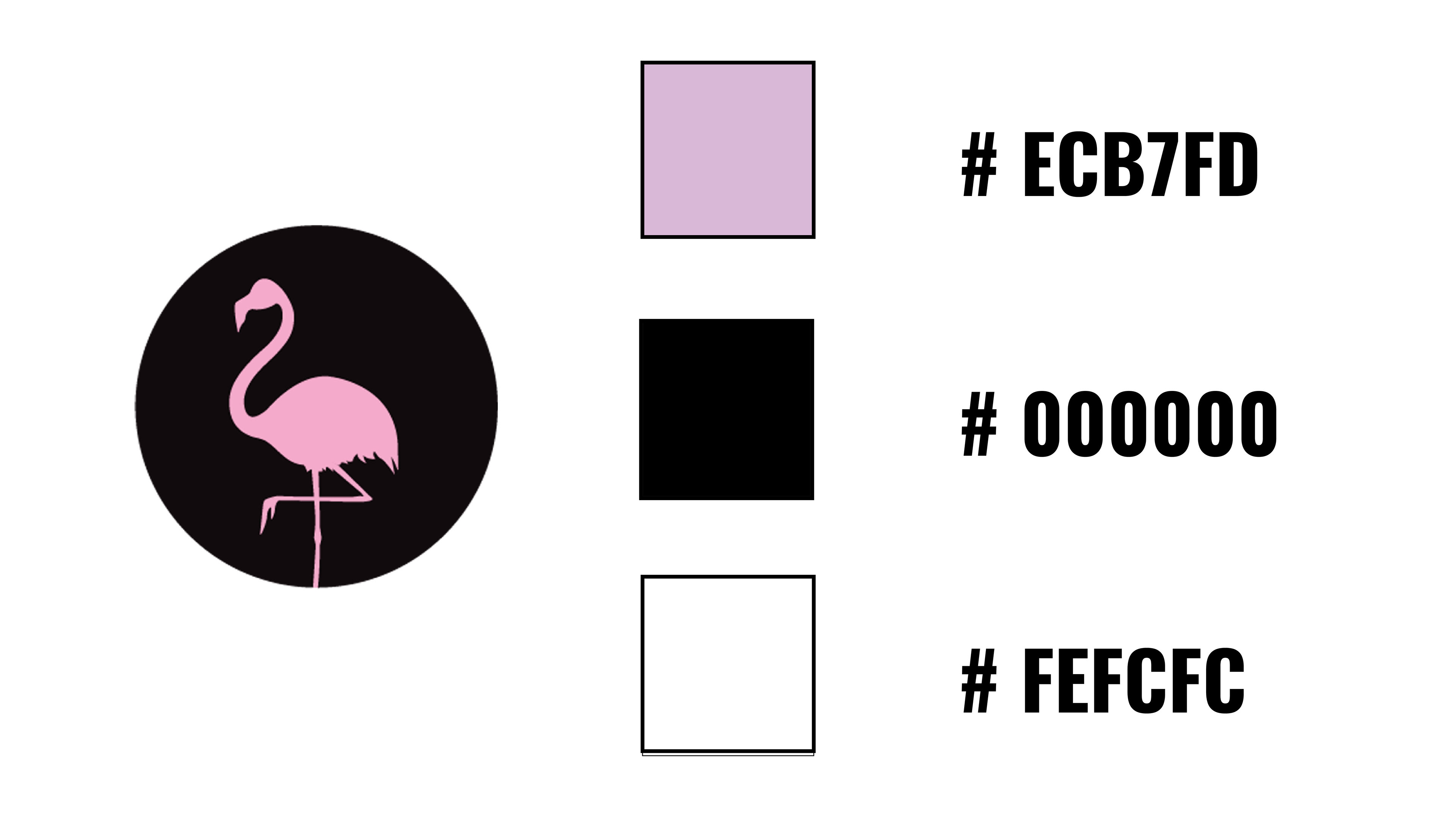
While I used the original logo, I decided to use a slightly more millennial purple as the main highlight colour, this contrasted nicely with the vintage pastels greens featured in a lot of Rippers promo images (photos by Zac). For typefaces I used the super bold Oswald for the header and an easy to read Rubik for the body copy.
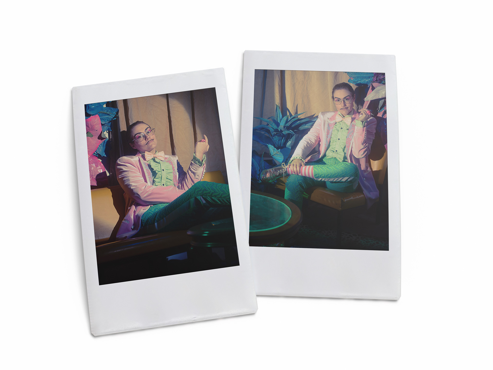
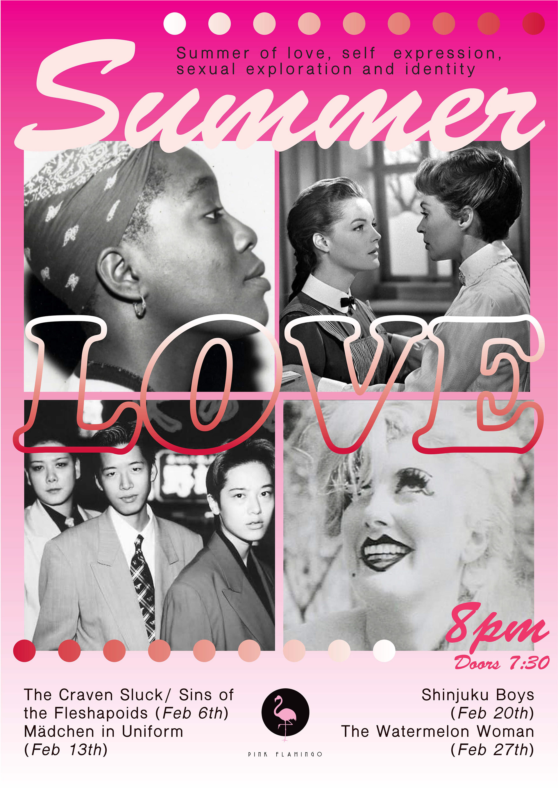
Summer of Love / Poster & Social Media Campaign 2020
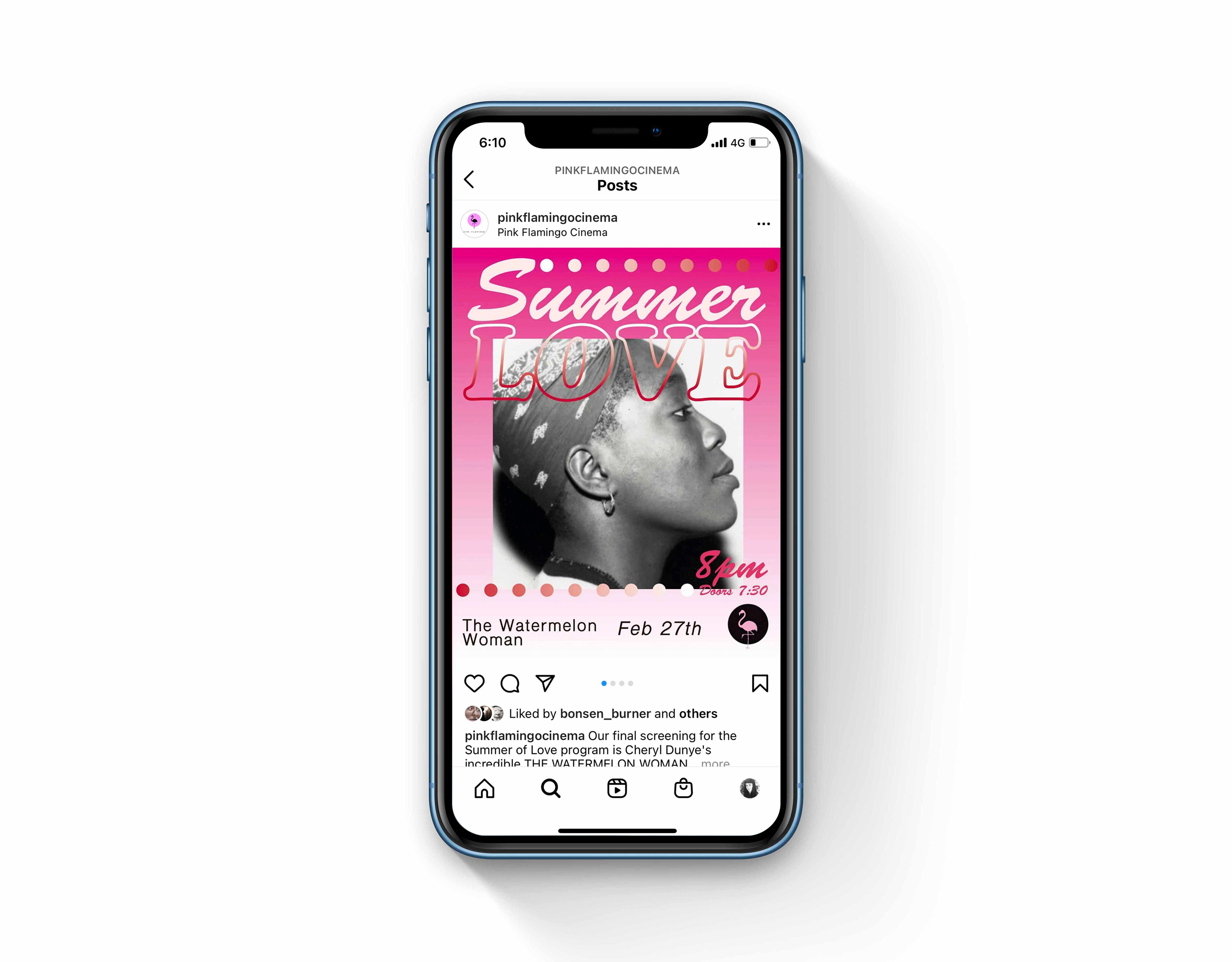
For this brief I was asked to create a poster and a series of social media tiles for the 'Summer of Love' Valentines 2020 program. I decided to use an early 90's California surf typeface contrasted with a more contemporary colour palette and of hot pink and Red to showcase this particular mix of titles.
Ex-Rental / Logo Design 2020
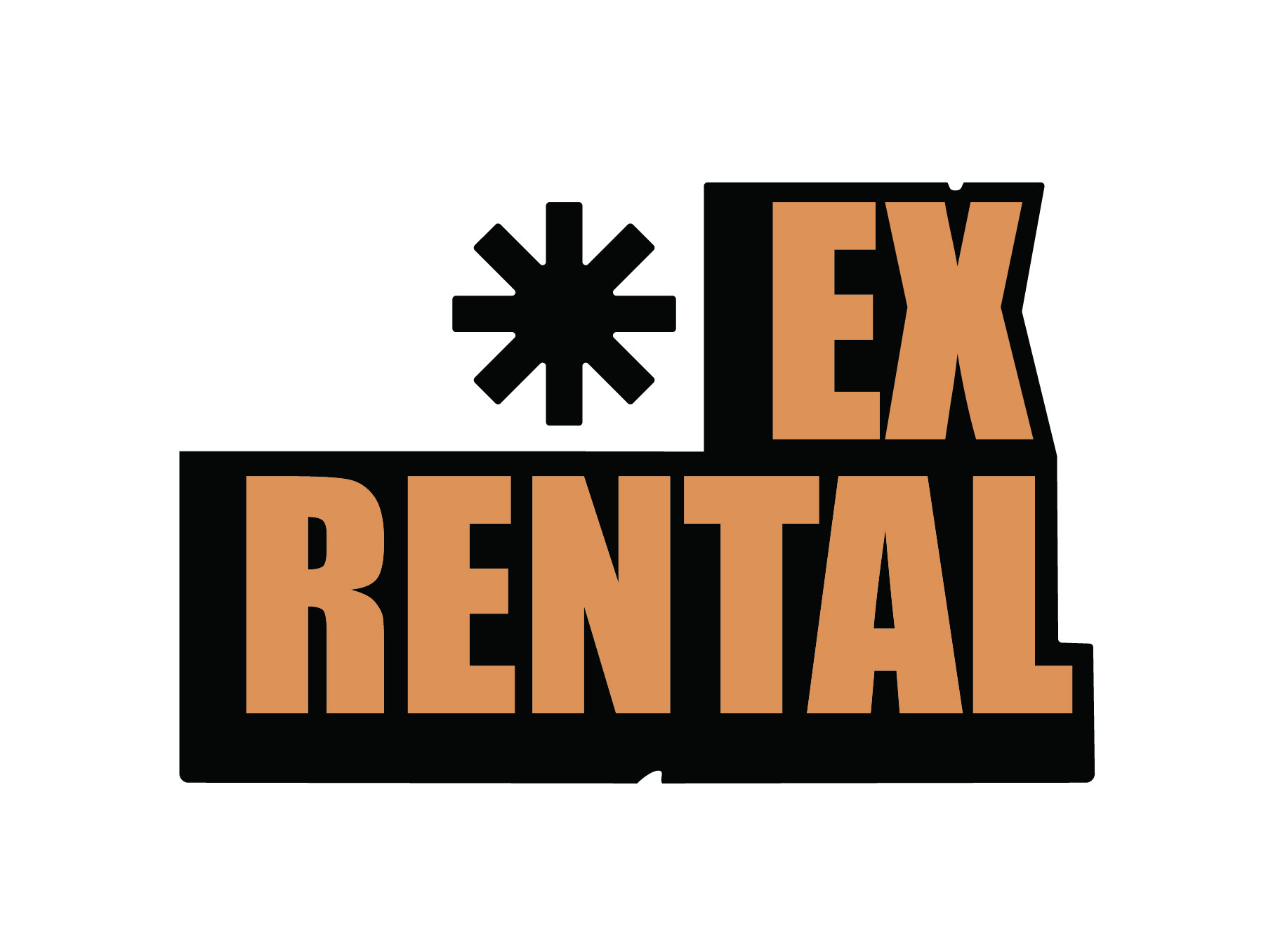
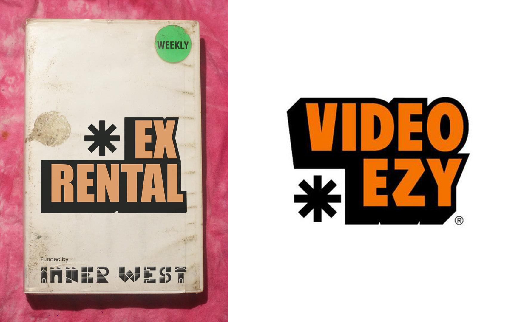
This was a simple brief - a re-imagining of the Video Ezy logo for the Ex-rental streaming night as part of the Inner West Extremely Online program. I decided to lighten the original orange and round off some of the sharp corners for a slightly softer and more vintage look. The final image on the left was completed by Ingrid Dieckmann.