"How might I create a the best online presence for a site with three jobs: e-commerce, online archive, and IRL bookings?"

Onnie knows that the majority of their clients arrive from Instagram, so it was integral that we build with a mobile-first mindset. Onnie's work is colourful and cheeky, so we decided to keep the backgrounds minimal and the font choices simple and bold. We chose the san-serif font 'Inter' in the end and rolled it out in print collateral as well. Our colour palette was a simple black, white, and baby pink for accents.

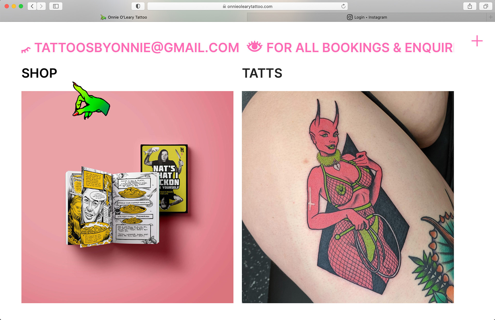

The other motivation for Onnie to get their website up and running was the potential for e-commerce. While Onnie sells a lot of their work through other distributors like Raking Light, occasionally they release smaller merchandise items and wanted the freedom to manage those sales on their own. We achieved the sales function by using Stripe to manage credit card and Paypal details.
