"How can we best explain complex directions to someone who has never visited this place?"

The problem:
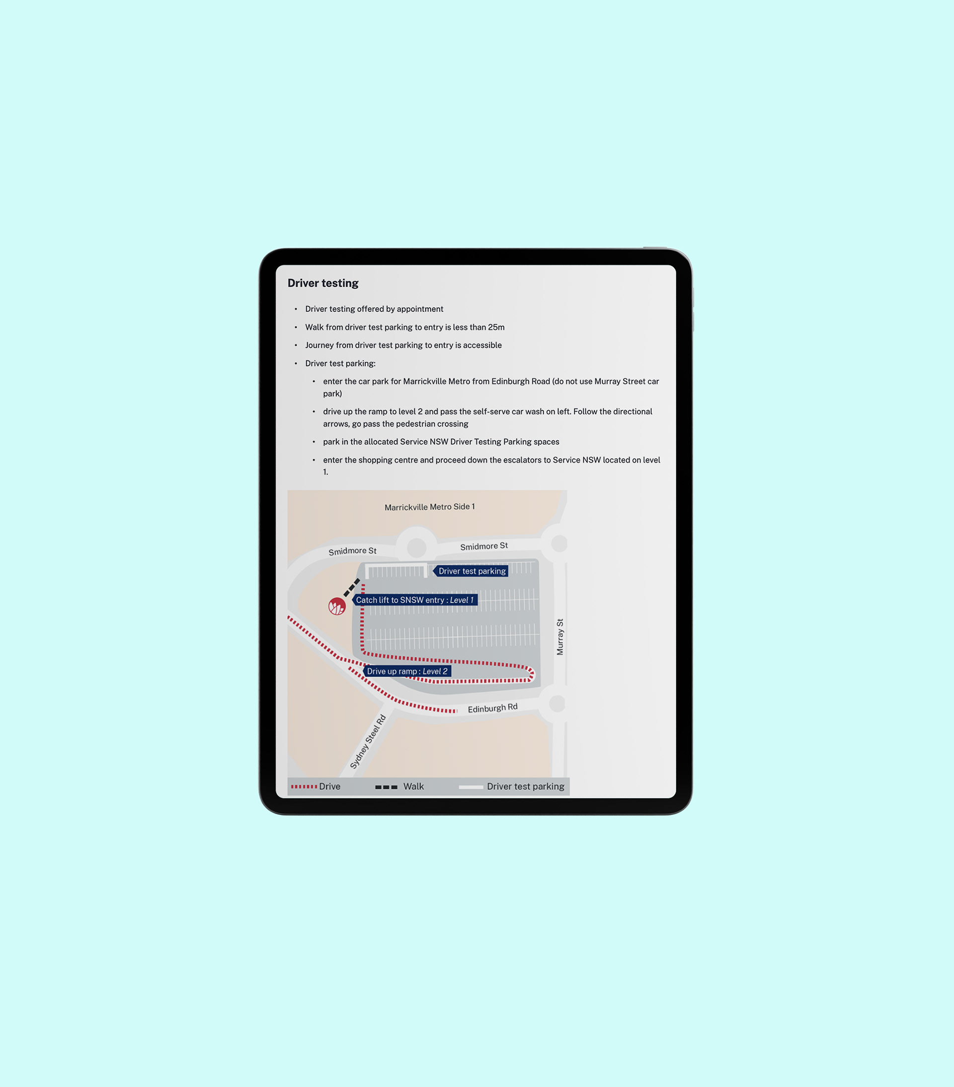
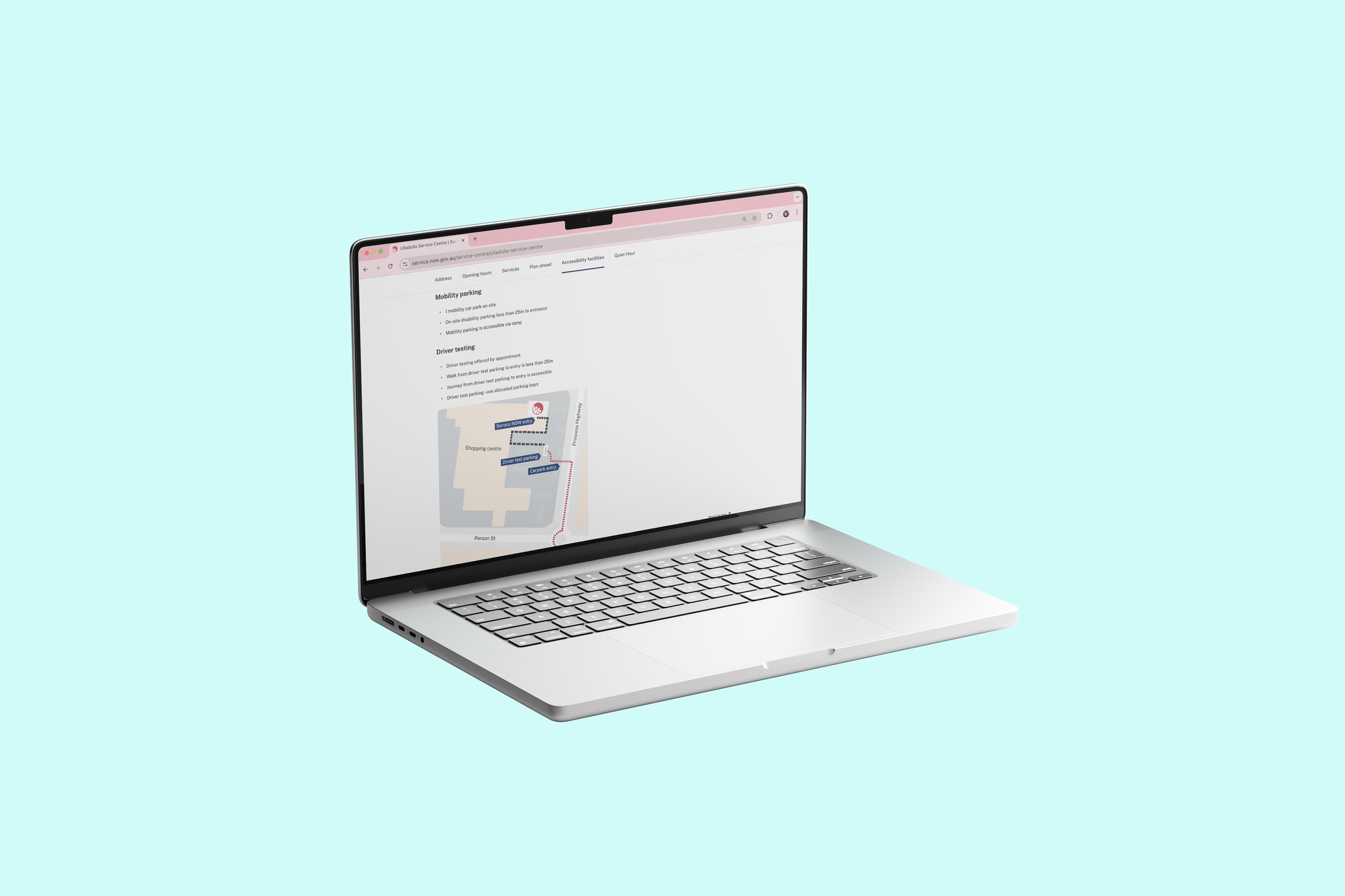
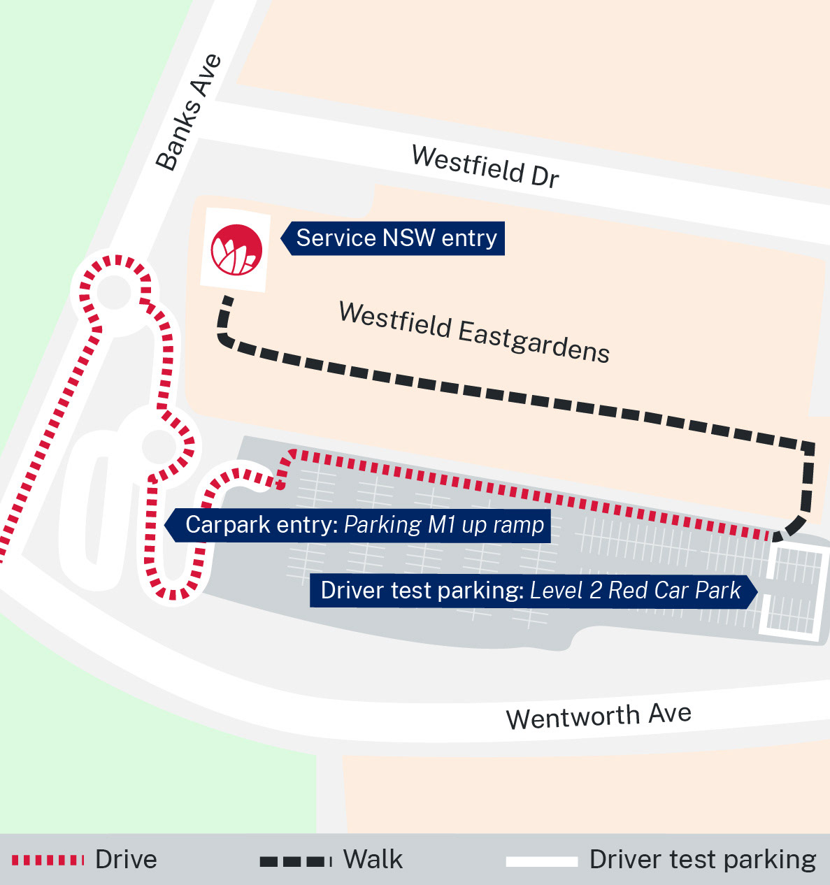
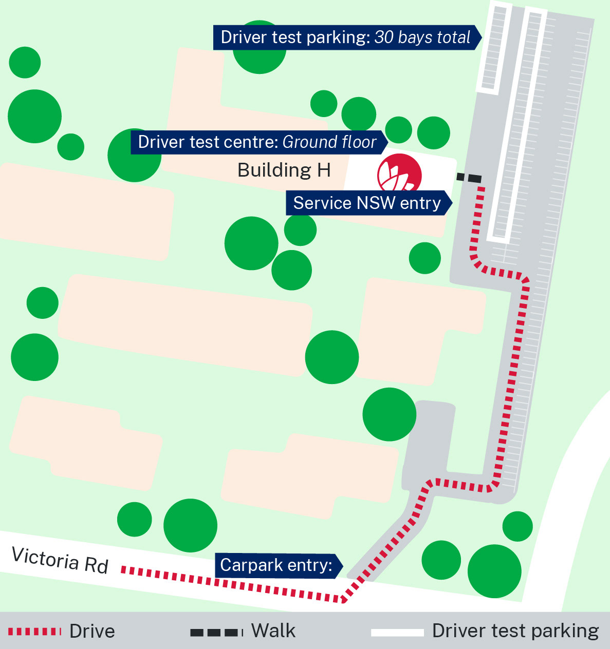
Service NSW service centres are all around NSW to help citizens interact with and complete in-person transactions, such as getting a drivers licence. While some centres are free-standing, many are housed within larger shopping centre precincts. To make sure that there is adequate space for driver testing customers to park, SNSW have a number of dedicated car parking spots within the larger shopping centre car park.
As many shopping centres are quite large, it can be difficult to describe the correct location of these spots and their relation to the Service centre using written content alone.
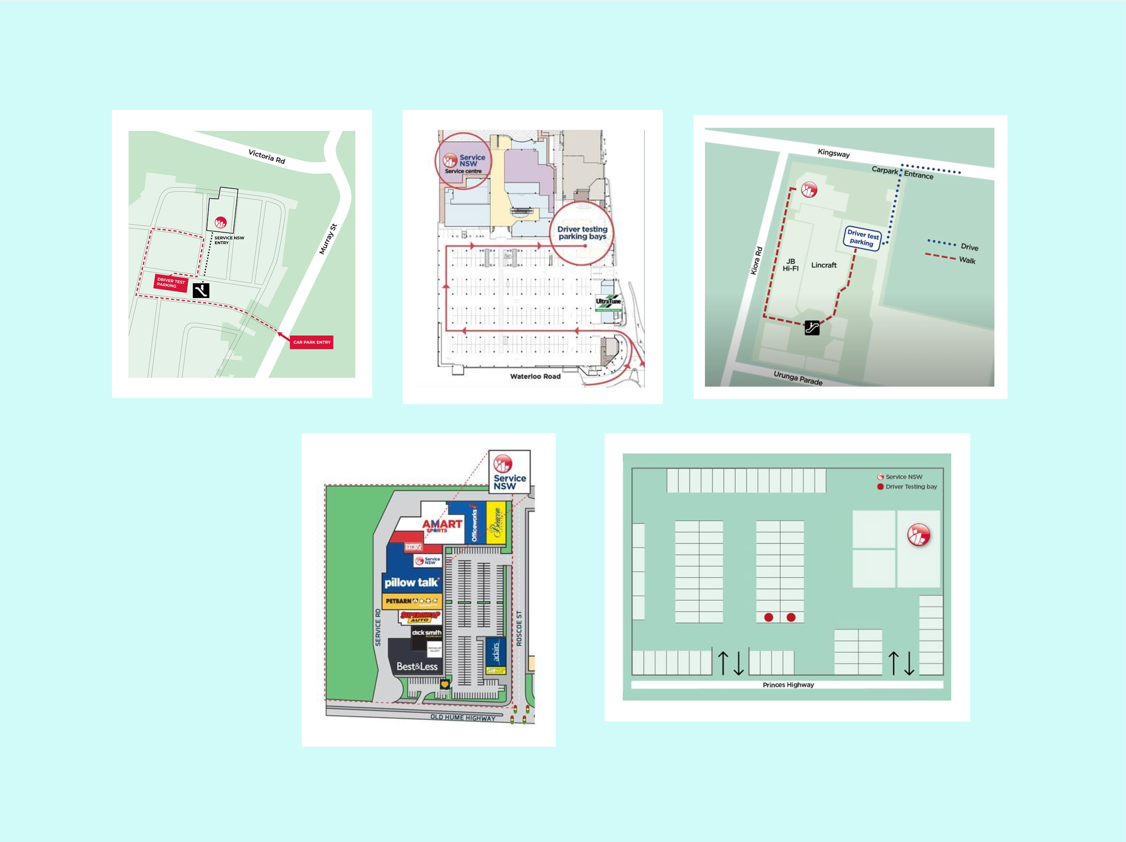
Previously, there was no official style for these maps, with graphics being created ad hoc by individuals based on shopping centre floor plans.
This meant that each graphic looked completely different, and varied from 1/3 to full width display on store pages. In addition to these issues, the graphics were created at different points in time, so elements like brand assets and surrounding retail shops had changed in many cases.
With the opening of several new SNSW store locations, and a recent update to NSW gov brand guidelines, it was the perfect time to update these maps to appear as a consistent suite of way-finding graphics.
The job could be broken down into three steps:
1) Create a new graphic style using the new NSW design system guidelines
2) Recreate old maps in this style
3) Create new maps for recently opened stores in this style.
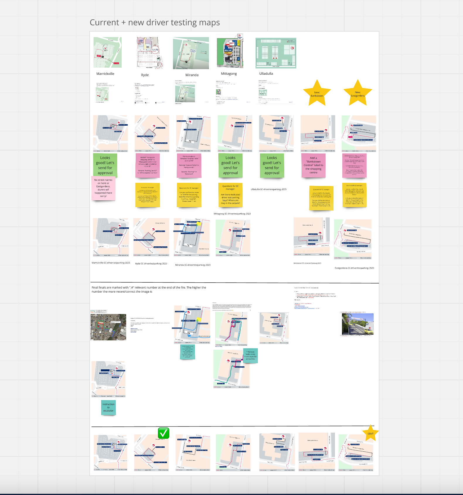
Due to the diverse locations of these stores, and the limits of understanding 3d spaces through flat online map tools, each graphic undertook several rounds of feedback. I documented this process in a Miro board, and used this tool to effectively report back to the principal designer in my team.
The best resource I had were the store managers of each site. Many sent me marked-up images with instructions for directions, and important site-specific information I would have had no other way of knowing. Some went as far as creating step-by-step journey documents with photos they had taken themselves.
Without their kind attention these details I would have had an impossible time trying to complete this task.
I created all the maps by hand in Adobe Illustrator, using google maps snippets as a guide and simplifying the terrain for clear visual instruction.
I felt it was important to create these graphics in a vector space so that it would be easy to re-export any of these images in a larger or different format if the website made visual asset upgrades in the future.
The final style is a flat, colour blocked graphic that is easy to read and understand, even when viewed on a smaller mobile device.
I made sure to use the specific language of the shopping centre, such as "Parking M1 up ramp" and "Level 2 Red Car Park" as opoased to more general directions. In this way I married the digital signposting with the in-person experience seamlessly.
What began as 5 disparate graphics on a handful of store pages has evolved into a large ongoing project, with around 20 maps having been created so far.
I hope all new drivers in NSW have an easier time locating their test site, and that this graphic update can take a small amount of stress off their plate.
To see these projects live visit service.nsw.gov.au/service-centre and select a service centre location within a shopping centre.