"How can can we create a consistent brand for a large and varied multidisciplinary project about nature & technology?"


My main inspiration for the typeface and illustration choices was museum and public gardens signage. I noticed that these touch points were usually accompanied by a botanical illustration, which is where the logo (based on Irish Moss) came from.

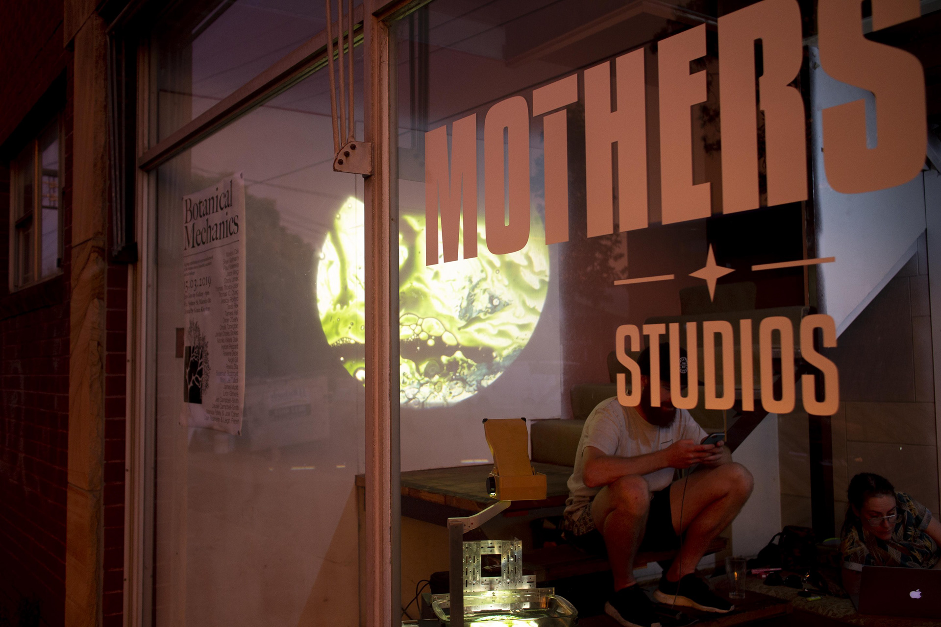
I chose to keep the colour palette monochrome, in part because the artwork and venue already have a lot of colour and character, so I didn't want to intrude in any way on them. My other consideration was the event's presence in ArtMonth 2019 which was also using a similarly paired back visual ID.